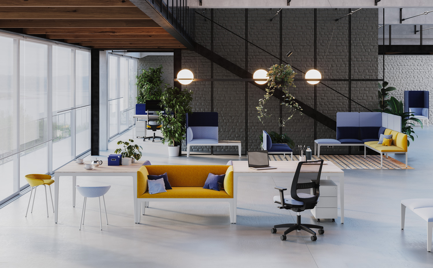
Take an office, change the colour of the walls every four days and ask the people who work there how things have been. The Texas researchers who did this test made a few discoveries: neutral or blue-green environments encourage productivity. Satisfaction at work went down with red walls. Grey walls made women feel melancholy, while it was shades of purple that made men feel similarly down.
For anyone who is planning a workspace, these notions are an added reason to abandon the tradition layout of white walls and bland furniture. What’s more, products currently available certainly do not lack variety of shades, materials and interior design styles.
Colour mood
So, what colour should you choose? Neurologists explain that chromatic stimuli from the surrounding space directly reach the centres of the limbic system, which is connected to the emotions of people who live and work in that environment. You could, for example, go for shades of blue or green – the colours most commonly found in nature – to create a relaxing atmosphere. Or add red detailing where performance and speed are required. A Canadian study associates it with improved reactivity in people who perform tasks that require concentration. The same study suggests that blue might enhance creative work.
Colour matches
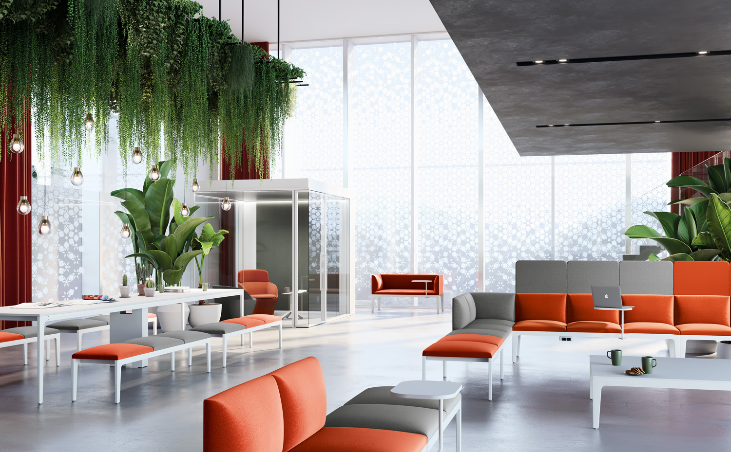
There is no unanimous opinion on how these mechanisms operate though. In recent years, the Wright Theory has become popular with Anglo-Saxon interior designers, a theory developed by the London scholar of the same name, in which she suggests examining shades of colour and their matches in the environment, rather than the impact of individual colours.
In essence, you can build a balanced colour palette by arranging complementary shades that are symmetrically opposite on the colour wheel in pairs or “harmonic triads”. But you can also choose from adjacent sectors (similar colours) or experiment with different levels of saturation of the same shade to create variations on a common theme: an effect that you can also achieve by mixing different materials and textures, based on the same colour. On the Internet there are colour palette generators that suggest colour matches based on “scientific” harmonic criteria.
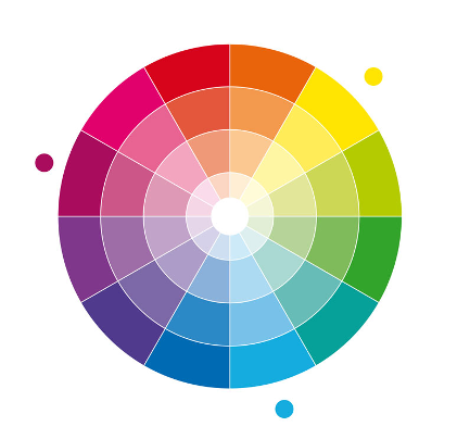


A complementary palette (left), a harmonic triad (centre) and a variation of saturation
Variables to consider
The colour plan of an environment must not overlook basic environmental conditions. Thus, a north-facing office, without direct light, will benefit from a palette centred around warm shades, just as bright, sunny colours might be necessary for a ground floor location with poor natural light.
In a company, you also have to factor in requirements dictated by the brand and its corporate image. Angela Wright, who has worked with the architects of various multinationals, maintains that colours do not affect individuals in the same way, but should be calibrated against their different personalities: a rule that can be extended to corporate identity. Every business should have a co-ordinated image, with a choice of corporate colours that express its personality and are also reflected in work environments. Creating that image is a team effort, which starts with designing the logo and culminates in the details of interior design, in the smart blend of science and sensitivity that makes the work of designers and planners so special.