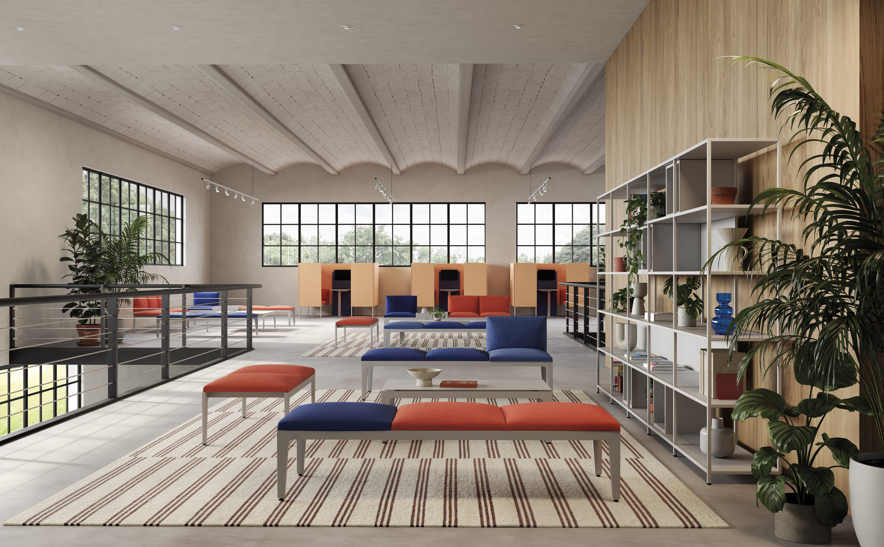
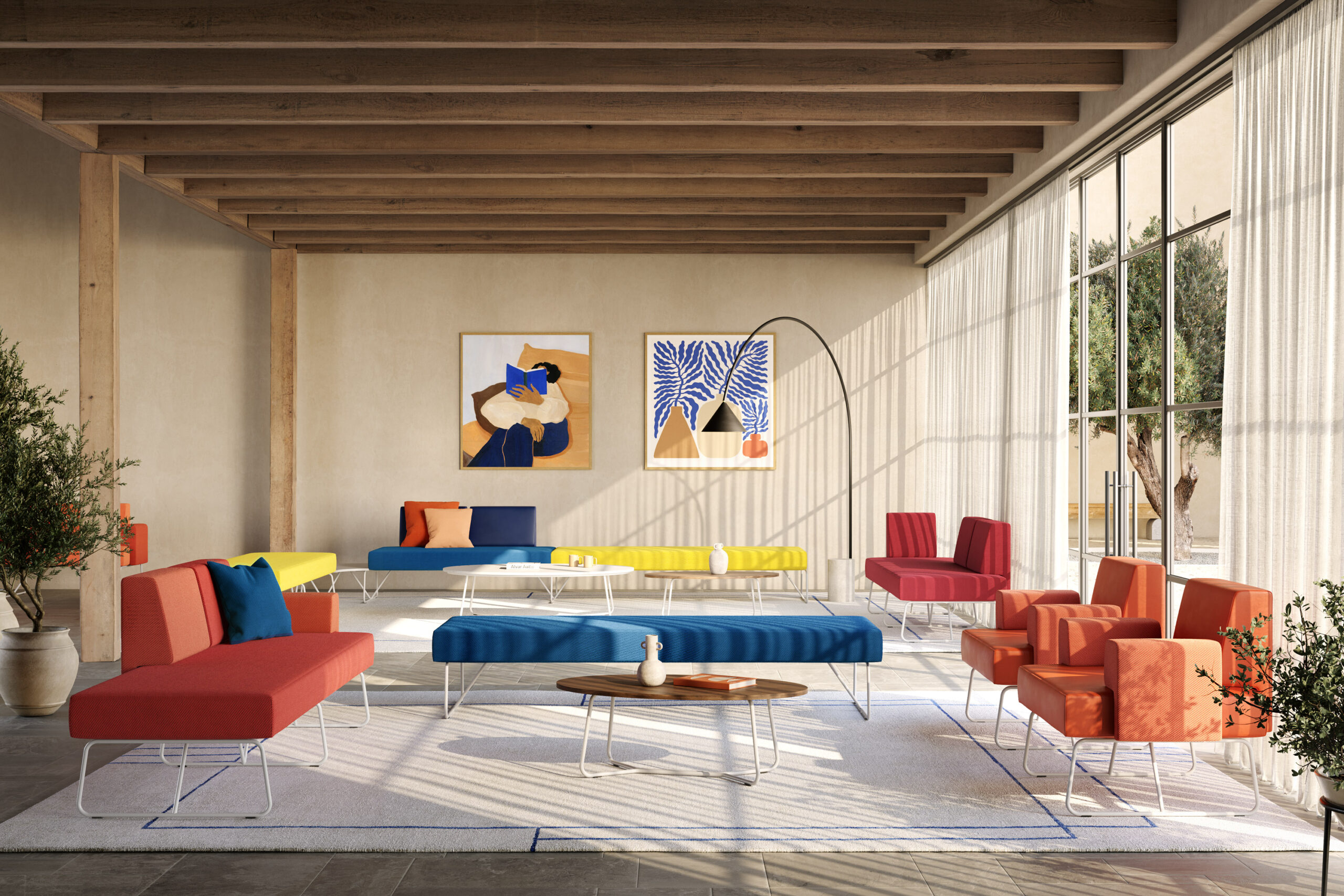
Colour is a fundamental element in interior design, as it can transform spaces and influence the emotions of those who live in them. In the office, colour is not only a matter of aesthetics, but also a strategic lever to improve employee well-being, motivation and productivity.
Choosing the right office palette is therefore a key aspect in fostering creativity, concentration, communication or relaxation in work spaces.
The psychological and physiological power of colours
It is widely proven that colours have a psychological and physiological effect. Each hue has specific properties that can stimulate or relax the mind, thus influencing behaviour, performance and well-being.
Cool colours tend to convey calmness, concentration, balance and harmony, while warm tones promote feelings of energy, passion and creativity.
There is no universal rule that establishes which colours are best for every office. The choice depends on many factors, such as the type of carried out activity, the target audience, the company’s corporate identity and the exposure and brightness of the rooms.
However, there is one essential reference point for creating a harmonious colour palette and balancing the different shades: Itten’s colour wheel.
The use of the colour wheel in interior design
The most famous and most widely used tool for initially orienting oneself in the choice of colours for any furnishing project, as well as for other areas such as fashion and art, is the colour wheel. Also known as the colour circle, it was created in the first half of the 20th century by Johannes Itten (1888 – 1967), a designer and exponent of the Bauhaus movement.
This effective graphic representation of primary, secondary and tertiary colours, makes it easy to identify the different combination possibilities in order to find the desired solutions.
In general, three types of colour combinations can be distinguished:
- Monochromatic combinations are based on a single colour shade, which varies only in intensity or saturation.
- Analogous combinations are based on two or three neighbouring hues in the colour circle and play on different tonal gradation.
- Complementary combinations are based on two opposite tones in the colour circle and are used to create a strong visual contrast.
In addition to purely chromatic considerations, one must also take into account the psychological meaning that each colour brings with it.

To every office its colour
The psychology of colours offers many insights into the design of working environments. Here are some examples.
- Blue encourages calm, concentration, communication and confidence. It can be used especially in offices that require intellectual, analytical or collaborative activities. It also conveys professionalism and reliability and is in fact very often associated with the financial or legal sectors.
- Red stimulates energy, passion, action and determination, as well as evoking courage and strength. It’s ideal in environments dedicated to physical, creative or competitive activities.
- Green evokes nature, growth, balance and harmony. It’s the most suitable colour for offices that require innovation, development or sustainability. It also conveys a concept of health and well-being, which is why it’s often associated with the medical or environmental sectors.
- Yellow evokes light, joy, optimism and creativity. It is particularly suitable for offices that require communication, expression or fun. It also conveys intelligence and originality and is therefore often associated with artistic or technological sectors.
These same colours, combined with each other or with other shades, can offer a multitude of different sensations, which must be explored from time to time by taking into consideration all the involved elements.
What will really make the difference is the interior designer’s expertise and experience.

